- What works?
- What doesn't work?
- What genre and how do you know? What conventions have been used?
- What message and or theme do you get behind the art choices the band have made?
- Simplicity makes it look like theyre trying too hard
- Conventions/ Symbolism of the heart and grenade
- Makes audience think about the album
- Can tell the genre through colours
- Use of the word 'Presents' gives the idea like its a tv show
- This adds a sense of pretentiousness
- Also makes them seem classic and old school
- Overall class opinion was that they did not like the album cover
- Pop art is a very recognised based off Andy Warhol
- Famous Art Style makes it look like the band is famous
- Classical but with a twist, makes it seem like the band is classical and with a twist
- Genre - Pop Rock
- Themes - Edgy and cool, Individuality
- Not cocky or pretentious
- Pushing Dyer Star Theory, trying to make their faces iconic
- Recognizable as a cartoon
- Who is the lead?
- Fails as a marketing ploy as we don't know the name of the band and the album name
- Iconic
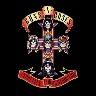
- Classic Rock Metal
- Religious Imagery
- Album artwork tends to look like tattoo art
- Skulls are a convention of metallic rock
- All have a trademark - their hairstlyes are iconic
- Represents the genre well
- Has the iconic slogan 'live fast and die young'
- Ribbons have a theatrical element like theyre constantly putting up a show


This is an excellent addition posts, and as well as being vial good you have also started linking your comments back to theory. You could add how hess designs will influence your own, but overall an excellent post.
ReplyDelete